I know, my thoughts exactly- almost like they now want to be pulled away from being called a wanna be Range Rover lolIn the images you shared - to me - the old style on the dark telly looks like design you'd see on an audi. The placement and spacing and scale is good. The new design on the white one looks like what you'd see on a... well... a Kia.
-
Hint: Use a descriptive title for your new message
If you're looking for help and want to draw people in who can assist you, use a descriptive subject title when posting your message. In other words, "I need help with my SUV" could be about anything and can easily be overlooked by people who can help. However, "I need help with my transmission" will draw interest from people who can help with a transmission specific issue. Be as descriptive as you can. Please also post in the appropriate forum. The "Lounge" is for introducing yourself. If you need help with your leather interior, please post in the Interior section - and so on... This message can be closed by clicking the X in the top right corner. -

You are using an out of date browser. It may not display this or other websites correctly.
You should upgrade or use an alternative browser.
You should upgrade or use an alternative browser.
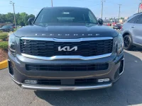
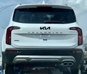
2022 sighting
- Thread author Tellephant
- Start date
🤖 AI Summary
No AI summary has been generated for this thread yet.
Yeah; honestly, I plan to do something to change it- I went with the everlasting SXP (non-nightfall), and now I am thinking I might as well just delete all chrome just to figure out what to do with the badging lol.Totally agree. But I think it will grow on a lot of people though. Especially if you vinyl wrap the back KIA logo and possibly completely delete the front emblem, or wrap the front one too. There will def be after market black new style KIA emblems all over in a couple months too. The Pictures all make it look like the new emblems sticks out a bit and you can pull/pop it off, or wrap it on the vehicle and cut the excess wrap off with with a crafting knife. Personally, I think the new logo looks way better on the steering wheel now as well and would look even better wrapped in gloss black. Only thing I’m pissed about is having to buy black wheel lugs lol (so weird they did a silver). The rest will look good wrapped or just completely deleted IMO. I bet you could even get creative and put a personal emblem (like the transformers emblems?) on the back instead of the KIA on the flat part
3M 2080-G12 Vinyl Car Wrap Film Sheet Roll with Air Release Technology - 5ft x 1ft with Application Card, Gloss Black
Amazon.com: 3M 2080-G12 Vinyl Car Wrap Film Sheet Roll with Air Release Technology - 5ft x 1ft with Application Card, Gloss Black: Automotive
Amazon.com: 3M 2080-G12 Vinyl Car Wrap Film Sheet Roll with Air Release Technology - 5ft x 1ft with Application Card, Gloss Black: Automotivewww.amazon.com
Thoughts on if wrapping or plasti dipping the logo black on an everlasting silver will just make it stick out even more though, and I have a feeling it’s not going to remove as easy as the previous due to the molding they’ve created for the badge. Guess we’ll just have to play around with it once it’s here

Seriously!I know, my thoughts exactly- almost like they now want to be pulled away from being called a wanna be Range Rover lol
Kia: "Hey, enough of this Range Rover talk. We're more of a funky Honda and we need to reflect that.
From the team that brought you the Kia Soul Hamsters, allow me to present.."
*pulls back drape revealing new Telluride back end*
*very light applause*

Last edited:
Socal949
Well-known member
- Joined
- Feb 24, 2021
- Messages
- 977
- Reaction score
- 433
- Points
- 63
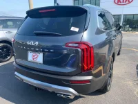
At least Kia got Night Fall emblem correct on the court

______________________________
Gravity Gray non-nightfall (appears to be SX-P+T, which is exactly what I have on order).
I personally think it looks great - never liked the old kia logo though. Especially like the new black grille; I think it helps tie in the black wheels a little better on the non-nf SX
I personally think it looks great - never liked the old kia logo though. Especially like the new black grille; I think it helps tie in the black wheels a little better on the non-nf SX
Attachments

tellmont
Active member
I like the new look too. Thanks for posting these pics. I think the redesigned badge will look really good on a GWP NFGravity Gray non-nightfall (appears to be SX-P+T, which is exactly what I have on order).
I personally think it looks great - never liked the old kia logo though. Especially like the new black grille; I think it helps tie in the black wheels a little better on the non-nf SX
To add more positive vibes for the '22s - I'm very happy with the new steering wheel look. I think the new logo looks great on it, and they thankfully got rid of that weird circle portion that stuck out on the horn previously.
Attachments

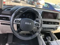
I'm totally fine with the front, it looks good. The steering wheel is an improvement. I just don't like the redesign on the back (especially the flat spot in the sheet metal for the logo) or that the KIA logos wont be blacked out on Nightfall. Appreciate the positivity! ")
______________________________
I'm inclined to say that in 10 years from now (yes, i'll keep mine that long) we'll be glad they didn't get digital gauges. They're going to improve so much in the next decade that in 10 years they'd look extremely dated. Analog will be retro but still classy. I wanted digital gauges, but then I watched a video on a Bugatti where they aren't yet making the gauges digital for that reason, it dates the car. Maybe small digital readouts here and there, but not the whole screen. There are a few niche vehicles from the 90s, 00s that had digital screens and the tech looks ancient now.So new logos and minor tweaks? Where's the digital cluster!!!!
AnyVare
FOUNDING MEMBER
- Joined
- Feb 20, 2019
- Messages
- 111
- Reaction score
- 117
- Points
- 43
That's an interesting viewpoint and would agree with it for a purchased Telluride; but with a lease you'd get the new tech in the next version/vehicle.I'm inclined to say that in 10 years from now (yes, i'll keep mine that long) we'll be glad they didn't get digital gauges. They're going to improve so much in the next decade that in 10 years they'd look extremely dated. Analog will be retro but still classy. I wanted digital gauges, but then I watched a video on a Bugatti where they aren't yet making the gauges digital for that reason, it dates the car. Maybe small digital readouts here and there, but not the whole screen. There are a few niche vehicles from the 90s, 00s that had digital screens and the tech looks ancient now.
StillinSaigon
Active member
- Joined
- Apr 28, 2021
- Messages
- 94
- Reaction score
- 113
- Points
- 33
The only car that I’ll disagree with you on was my 1964 Thunderbird with the liquid speedometer along the bottom of the instrument cluster. When I got rid of it the speedo was still working. Needed another ring and valve job but everything.else was perfect. It was bought new but it was burning oil when it was new. Damn Ford big block.I'm inclined to say that in 10 years from now (yes, i'll keep mine that long) we'll be glad they didn't get digital gauges. They're going to improve so much in the next decade that in 10 years they'd look extremely dated. Analog will be retro but still classy. I wanted digital gauges, but then I watched a video on a Bugatti where they aren't yet making the gauges digital for that reason, it dates the car. Maybe small digital readouts here and there, but not the whole screen. There are a few niche vehicles from the 90s, 00s that had digital screens and the tech looks ancient now.

______________________________
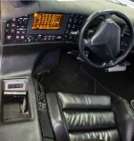
Check out the screen on the 1991 Vector W8. In fairness, the idea here was to make the cockpit look like a fighter jet. I think most or all gauges will be digital eventually, but going to be several years till they are standardized and more future proof imo. Maybe we are there now. I guess they are probably already updateable though.
Attachments
StillinSaigon
Active member
- Joined
- Apr 28, 2021
- Messages
- 94
- Reaction score
- 113
- Points
- 33
Bearicus23
Member
- Joined
- Jun 5, 2021
- Messages
- 39
- Reaction score
- 14
- Points
- 8
I seriously think that would happen in 23'. With the quick turnaround by turning some features more standard throughout the trim and because of chip shortages happening plus slow production, aint happening at the moment.What else can they improve on the next year? Hopefully digital cluster, a better engine performance plus more standard features on all trim.So new logos and minor tweaks? Where's the digital cluster!!!!
Wow. Yeah. Not good. Feel especially happy to have a ’21 NF. Especially as here in Mass. they’re not allowed to activate UVOlink for
The rear emblem looks good blacked out. You could also try white-out on GWP. It should look nearly transparent white on white, right?I still think I’m at least going to blackout the rear emblem. On a GWP NF? I’ve got to. So I played around with the above photo and found there’s hope for the new emblem as far as I’m concerned.
______________________________
Butch Cassidy
Well-known member
I’m still wondering how it would look it the rear logo was simply deleted. I know it has the flat spot on the lid tho…
I think the biggest problem, aside from the color on the nightfall, is that it is disproportionately large. It’s just a huge logo, and the new logo is weird.
I think the biggest problem, aside from the color on the nightfall, is that it is disproportionately large. It’s just a huge logo, and the new logo is weird.
chowfun27
Member
- Joined
- Jun 9, 2019
- Messages
- 54
- Reaction score
- 57
- Points
- 18
I’m still wondering how it would look it the rear logo was simply deleted. I know it has the flat spot on the lid tho…
I think the biggest problem, aside from the color on the nightfall, is that it is disproportionately large. It’s just a huge logo, and the new logo is weird.
Not having anything on the flat spot is going to exaggerate the fact that the emblem is missing. I would have personally thought it would have been easier to source a curved emblem for the rear and retrofit it to the 20/21 rear hatch design than change the stamping design but guess not. I agree the rear badge is a little disproportionally large but it's funny because I bet the emblem existed first and then the stamping changes were dimensioned to accommodate that. That's why the flat spot is so large..
In my own unprofessional opinion, curving the emblem, or making it a bit smaller and placing it above the curve on the rear hatch would have been a much more attractive option. Then they could have left the "TELLURIDE" in the same size and placement as before. Done and done.Not having anything on the flat spot is going to exaggerate the fact that the emblem is missing. I would have personally thought it would have been easier to source a curved emblem for the rear and retrofit it to the 20/21 rear hatch design than change the stamping design but guess not. I agree the rear badge is a little disproportionally large but it's funny because I bet the emblem existed first and then the stamping changes were dimensioned to accommodate that. That's why the flat spot is so large..
That is pretty interesting (and weird?) like you pointed out, that they decided to reshape the sheet metal itself to accommodate the emblem instead of potentially changing the size and shape of the "KN" emblem. Maybe they had to reshape the metal anyway as I think the previous hatch was shaped to accept the oval logo. But then they decided to change the size of the *TELLURIDE* badging? Super weird that they would do that instead of resizing / reshaping the "KN" logo. Totally guessing here, but I bet the rear emblem is the same part as the front emblem, and it might even be shared or will be shared with other vehicles. That would probably save some money and accounting on the supply chain, but it's a car that has probably 40,000 parts, what's one more part when it affects the exterior appearance of the vehicle?
Maybe their design team has a lead on what the styling trends are or will be, and I'm just getting old and unstylish.
 I'm waiting on a '22, and when it arrives I'll leave it as is for a bit and try to love it for its quirks before making any changes.
Last edited: