tazzytazzy
Active member
- Joined
- Aug 24, 2020
- Messages
- 153
- Reaction score
- 124
- Points
- 43
Our new K5 has the same size screen as the Telluride, 10" or so. The k5 has the updated Nov update, while the Telly doesn't.A few additional observations on the update:
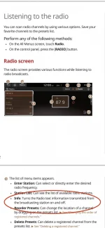
I noticed the song/show title doesn’t display on the new Home Screen when listening to SiriusXM. Seems like a big miss to have all that unused space and not show it. My wife’s Subaru shows album art from Sirius too. That would be better than the vacuum tubes on the radio screen.
While the integrated map is cool on the Home Screen, it’s puzzling why they would align it to the right side of the screen and make the driver look that much further away from the road to see the map. Seems like a poor UX decision and one that was made in a conference room instead of in a usability lab.
Another annoyance in the new radio ( besides all the wasted space for the new channel number display) is the preset menus. You have to reach all the way over to the right to change the bank of presets to the next set. I believe the old way was a vertical swipe to scroll, which is much easier. Sure, you can use the steering wheel controls, but why make the touchscreen design more cumbersome to interact with more clicks and smaller text? Just seems like poor design and more opportunity for distraction.
Overall, I don’t hate it, but I’m pretty puzzled as to why a $52k car would have such a big screen and then make such a major update to downgrade functionality and leave so much screen wasted. This feels like design made for the conmonality of all models in the lineup when Telluride should be getting its own customizations and not have to have the same limitations as a basic Soul, for example.
This should not be a budget design decision as it will erode the brand equity the Telluride had already built up, not to mention tick off owners. Let’s hope stuff like this sinks into someone’s head at Kia for future updates.
They should optimize display size, or have different UI builds for each display size, while the logic underneath should be the same. It appears they made the UI small for the smaller screens, but for the larger screens, they just added padding and wasting space. The defeats the benefit of the larger display in every aspevt except when displaying the map.
All modern software design patterns should separate the UI from the logic so that a different UI can be provided easily.
Going to hold off on upgrading the Telluride.


