• Hint: Use a descriptive title for your new message
    If you're looking for help and want to draw people in who can assist you, use a descriptive subject title when posting your message. In other words, "I need help with my SUV" could be about anything and can easily be overlooked by people who can help. However, "I need help with my transmission" will draw interest from people who can help with a transmission specific issue. Be as descriptive as you can. Please also post in the appropriate forum. The "Lounge" is for introducing yourself. If you need help with your leather interior, please post in the Interior section - and so on... This message can be closed by clicking the X in the top right corner.
  • Car enthusiast? Join us on Cars Connected! iOS | Android | Desktop

2022 sighting

🤖 AI Summary

No AI summary has been generated for this thread yet.
Yuck, what a blunder on the back and the bright logo badges on the Nightfall. Seriously they have badging in two different colors right next to each other? And they cut out a hexagonal shape on the back so the logo can lay flat. So that will look weird debadged. I'll likely be plasti-diping those and not happy about it. Let me know what the best color paint is to match the "telluride" lettering. I'd like to get a look at the wheel caps too. Hope the logo isn't bright there as well. This would almost move me to not get the Nightfall if I didn't think it looked better on the everlasting silver. And they're charging $100 more for it this year... People going for the blacked out look with Nightfall on Ebony Black or any dark color are not going to be happy with the bright "KN" I don't think. Nor white potentially, the "telluride" contrasts with the paint but the logo blends into the paint? Meh.
 
Last edited:
I was thinking the badge refresh would be a positive thing but omg it looks gaudy.
 
Yuck, what a blunder on the back and the bright logo badges on the Nightfall. Seriously they have badging in two different colors right next to each other? And they cut out a hexagonal shape on the back so the logo can lay flat. So that will look weird debadged. I'll likely be plasti-diping those and not happy about it. Let me know what the best color paint is to match the "telluride" lettering. I'd like to get a look at the wheel caps too. Hope the logo isn't bright there as well. This would almost move me to not get the Nightfall if I didn't think it looked better on the everlasting silver. And they're charging $100 more for it this year... People going for the blacked out look with Nightfall on Ebony Black or any dark color are not going to be happy with the bright "KN" I don't think. Nor white potentially, the "telluride" contrasts with the paint but the logo blends into the paint? Meh.
______________________________
 

Attachments

  • 585040B5-2BA7-4047-AB35-A4BF53FAFA88.webp
    585040B5-2BA7-4047-AB35-A4BF53FAFA88.webp
    107.8 KB · Views: 210
Unreal. It’s going to backfire- more folks are going to debadge and they’ll loose all marketing. Especially with nightfall.
The badges are just taped on, right?
The guy in the video said they squared off a bit where the back one is.
 
Yuck, what a blunder on the back and the bright logo badges on the Nightfall. Seriously they have badging in two different colors right next to each other? And they cut out a hexagonal shape on the back so the logo can lay flat. So that will look weird debadged. I'll likely be plasti-diping those and not happy about it. Let me know what the best color paint is to match the "telluride" lettering. I'd like to get a look at the wheel caps too. Hope the logo isn't bright there as well. This would almost move me to not get the Nightfall if I didn't think it looked better on the everlasting silver. And they're charging $100 more for it this year... People going for the blacked out look with Nightfall on Ebony Black or any dark color are not going to be happy with the bright "KN" I don't think. Nor white potentially, the "telluride" contrasts with the paint but the logo blends into the paint? Meh.
You have a good eye the guy who did the video said it’s squared off for the emblem in the back.
I notice they did remove the trim level from the back end. Perhaps my Glacial White Pearl with Nightfall will offset the new white Kia emblems. No trim levels? Guess I’ll get used to a plain back end now.
there is something black above the awd but i can’t tell if they is the trim level
 
I was thinking the badge refresh would be a positive thing but omg it looks gaudy.
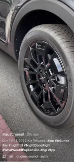
The new logo looks okay on the nightfall wheels.
 
This is a sx nightfall one for 22.
I'm sorry but the silver Kia badge looks horrible and tacky on the nightfall!! I kinda liked the new kia refresh but the way they executed is just sad.
______________________________
 
Last edited:
I bet this isn’t the final production iteration of the new logo’s implementation. Seems like this could have been a publicity event where Kia would want their logo to be obviously visible (unlike a blacked out nightfall logo).
I hope youre right! Looks out of place. And the different font (KIA v Telluride) is not a good look.
 
Why in the world would they not black out the Kia badges on the nightfall edition? That's the whole point of that package. I'm sure it would be easy enough to black them out somehow, but we shouldn't have to be doing that on a blackout package. Making me kind of rethink my 2022 nightfall order and maybe try to find a 2021 somewhere.
 
Why in the world would they not black out the Kia badges on the nightfall edition? That's the whole point of that package. I'm sure it would be easy enough to black them out somehow, but we shouldn't have to be doing that on a blackout package. Making me kind of rethink my 2022 nightfall order and maybe try to find a 2021 somewhere.

1623594763263.png
______________________________
 
Why in the world would they not black out the Kia badges on the nightfall edition? That's the whole point of that package. I'm sure it would be easy enough to black them out somehow, but we shouldn't have to be doing that on a blackout package. Making me kind of rethink my 2022 nightfall order and maybe try to find a 2021 somewhere.
My thoughts exactly on the US version step bars on a nightfall. Why KIA?!
However they might actually look good now on a '22 with the matching silver emblems 🙄
 
I'm sorry but the silver Kia badge looks horrible and tacky on the nightfall!! I kinda liked the new kia refresh but the way they executed is just sad.
I agree the new logo looks terrible for reasons that others noted. Just saying the logo doesn’t look too bad in the rims. Maybe because it’s small and non -obtrusive. But it looks horrendous on the back side of the vehicle.
 
I did this to my Maxima, and it's really easy. However, I'm just saying I don't understand why they wouldn't black them out from the factory on a nightfall.
My guess is because they are proud of the new logo, the vehicle, and their sales and they want on-lookers to know this is a Kia. Problem is they're doing that at the expense of the attractiveness of their vehicle (in my opinion).

Overall, it's a relatively small thing, but I think it screws up the Nightfall look, and the different colors and sizes between the logo and telluride badging plus the change in scale of each plus the flat panel where the "KN" sits has really cheapened the look from the back.

At + $300 for a 22 SX Nightfall vs a 21, I wish I would have gotten a 21. Hopefully the 22 comes with some quality fixes for things like the drivetrain vibration issues.
______________________________
 
I agree the new logo looks terrible for reasons that others noted. Just saying the logo doesn’t look too bad in the rims. Maybe because it’s small and non -obtrusive. But it looks horrendous on the back side of the vehicle.
Do we have a picture of the logo on the wheels on a nightfall?

Edit: I saw them, thanks for the pic. Went from black lugnuts to silver.... grumpy face.
 
Last edited:
If I had a 2022 SX Nightfall. I'd PlastiDip that front logo with an amber to match the DRLs 😎
 
If I had a 2022 SX Nightfall. I'd PlastiDip that front logo with an amber to match the DRLs 😎
maxresdefault.webp
Our just go all out with blaze.

If you're going gaudy, no point in holding back.
 
I’m sure someone will come out with aftermarket replacement logos soon. Black and smaller would work.
Sure takes value away from NF though. Reconsidering my choice to go with it.


Back
Top